


Adult Cruising
While designing the entire on-board experience for Virgin’s ascent into the world of cruising, I co-led an incredibly talented team (UX, UI, content and motion).
The digital ecosystem consisted of a 7-in-one mobile app including a unique booking engine, advanced messaging features, food ordering & way-finding.
In addition to developing accessible 80” touch screens, cabin environment control (incl. media libraries) and customer support tablets.


Objective
To explore and deliver an ecosystem of user tested products based on Virgin Voyages evolving requirements within tight sprint cycles to allow for both build and quality assurance testing prior to the Scarlet Lady’s first voyage.
Role
Myself and co-leads worked closely to ensure the cadence, quality of work, client management and delivery timings were met. Often wearing multiple hats, this role involved the close collaboration of various respective disciplines (of a 25 practitioner team)
Challenges
Onboarding (pun intended) into a programme already 2 years into its strategic direction, this design focused project involved guiding digital product decisions and design direction with the support of various divisions within VV
Existing Direction

Stakeholder kickoff workshop

Basic user flows
Fleshed out journey details
It starts with a plan

Working closely with the Virgin Voyages leadership team, we were able to get a deep insight into the the brand they wanted to create and the target audience they wanted to appeal to. This close collaboration fed directly into our product exploration (challenges, needs & opportunities) and shaping (prototypes, insights & visions).
We encouraged a co-creation culture and organised sprints focused around communicating visually and inclusively. This approached ultimately gained a shared understanding of the problem space.
Project cadence was organised around iteration allowing us to spot mis-alignment early, avoiding risks and building confidence in the favoured ideas.
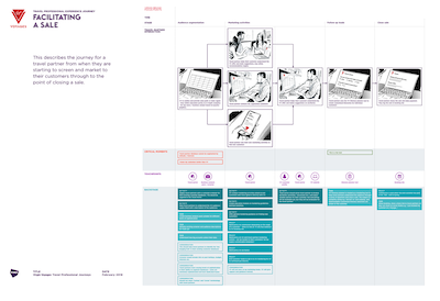
Mapping the Voyage
Over the course of the project we practiced various methods of co-creation to help explore & define the experience (incl. crazy 8’s, stakeholder interviews, site visits and task analysis). This allowed the wider team to create a shared understanding and help identify what needed to be produced. On a project of this scale it became an invaluable part of the design process and helped to understand the relationship between various devices and features.


Companion App


Colour
The VV colour scheme evolved as we explored and stress-tested its use. This played an important part of the alignment across multiple streams of work. The naming conventions allowed for a token based design system for cross platform compatibility i.e. Tropical Blue, Red Snapper etc. In addition, colours became synonymous with specific interaction patterns i.e. Red snapper for primary action and Tropical Blue for success states

Content
Prior to the final content creation, a carefully curated selection of example imagery supported the development and acted as guidance for a fitting brand language. Playful, energetic and classy. Images were chosen from Pinterest, Unsplash and a selection of favoured photographers to encapsulate the new brand’s visual direction

Type
The project was grounded using various weights of the sans-serif Centra No. 2, while a special reservation was made for key headlines (using a custom VV typeface). This remained consistent across all devices, web and marketing material

Space
Using a linear spacial system with key guides (margins, line height in body copy, minimum element spacing etc.), allowed for both consistency and flexibility across this diverse project. Specific areas required their own systems i.e. Digital signage (due to it’s scale; 80” screen)
Shake For Champagne™


Cabin Tablet


Annotated design delivery
Documentation delivered for build to various overseas development partners
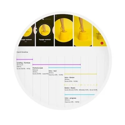
Animation specifications
Animation timing and easing properties defined to ensure correct specification was met

Product definitions
Various product definitions to explain specific features (example includes the themed alarms)
Digital Signage


